SS28 Colour Trends
Dark Summer Colour: The SS28 After Dusk Palette
Aubergine, midnight blue and swamp green are reshaping summer colour for SS28. Explore the After Dusk palette and how to wear dark shades with contrast and light.
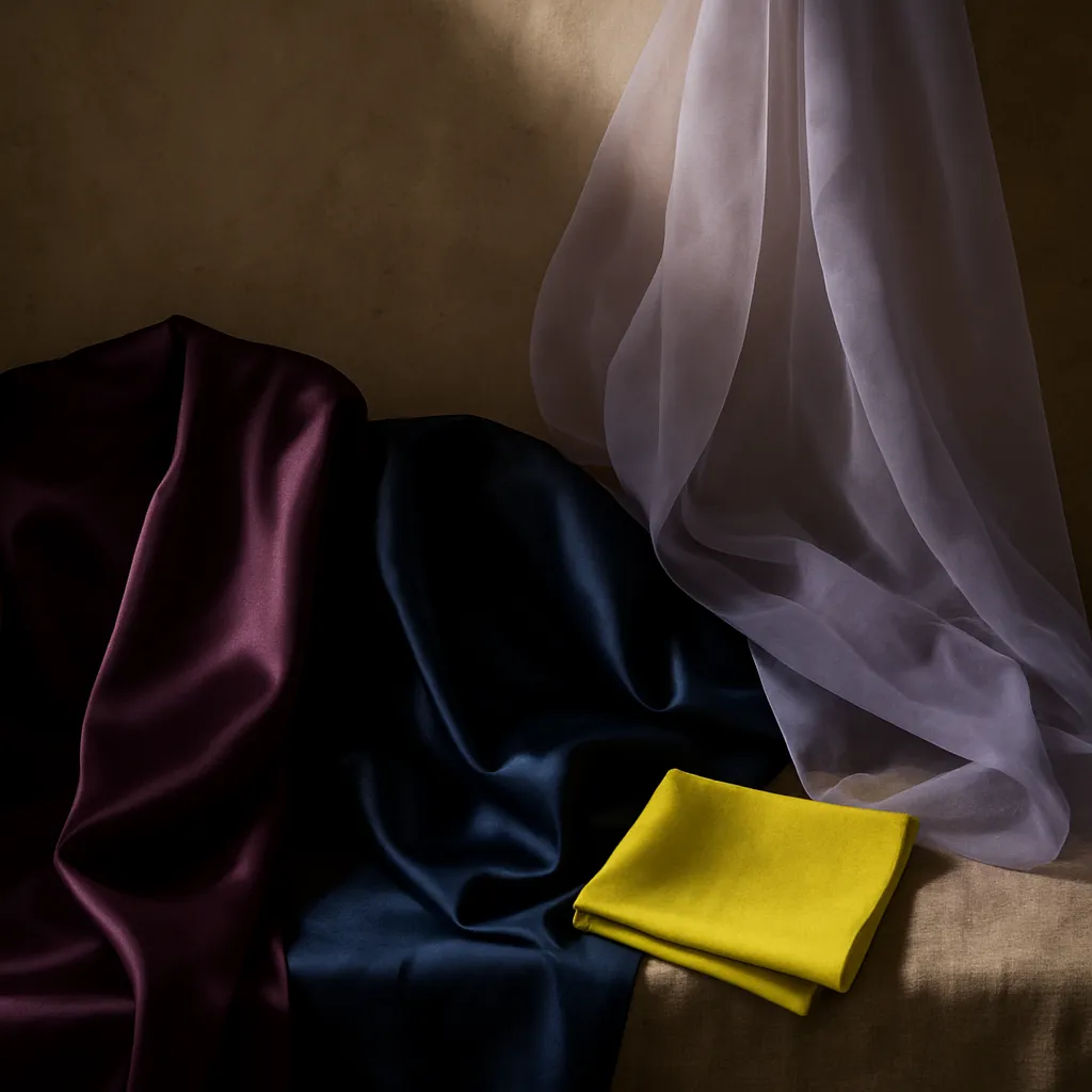
Summer has always come with its own colour codes: sun-faded pastels, tropical brights, crisp linens and cheerful shades made for long days. For Spring/Summer 2028, that picture is changing. Deep aubergines, inky blues and murky greens are bringing a darker, more moody feel to warm-weather dressing.
There is a gothic undercurrent at play, yet this is still unmistakably summer. It speaks to a growing appetite for colour with depth and emotional intensity. Instead of leaning on brightness alone, designers are setting shadow against light and dark shades against sudden flashes of vivid colour.
This direction, which we call After Dusk, challenges conventional ideas of seasonal colour. Its appeal lies in the tension between opposites: dusky purple against bare skin, earthy green in a featherweight fabric, or blue so dark it reads as black, punctuated by one acidic accent.
For SS28, darkness is not the absence of colour. It is a new way of making colour felt.
A Culture Drawn to the Dark
From gothic romance to supernatural cinema, darker aesthetics keep finding new audiences. Emerald Fennell’s Wuthering Heights, released in February 2026, brought renewed attention to romantic excess and heightened emotion. Sinners and Wednesday show how darkness moves between horror, fantasy, fashion and personal identity.
These references do not map neatly onto a palette, but they point to a wider mood in which darkness feels expressive and individual. Gothic codes are being reinterpreted rather than repeated, with lace, corsetry and dramatic silhouettes made contemporary through unexpected styling and lighter materials.
The changing experience of summer adds another dimension. As extreme heat reshapes daily routines in many regions, evenings offer new opportunities to socialise and explore. Twilight and artificial light bring a different visual language to the season, built on atmosphere, shadow and contrast.
The New Language of Dark Colour
After Dusk moves beyond a single idea of darkness, mixing saturated shades and earthy tones with softer colours that catch the light.
Aubergine Skin gives purple a rich, intimate quality, offering an alternative to familiar summer pinks and reds. Solar Midnight explores the depth of blue, appearing almost black in some lights and revealing its colour in others. Smoky Lavender softens the palette with a hazy quality that suits translucent layers and delicate textures.
Swamp Green brings an earthy, mineral character to utility dressing and natural materials. Cloud Bloom provides a luminous counterpoint, opening up the darker shades, while Fruit Punch cuts through with juicy intensity.
Contrast Is Key
For SS28, dark colour is most compelling when it is not worn head to toe. Pair Aubergine Skin with Fruit Punch for a clash of depth and energy. Set Swamp Green against vivid yellow to balance the organic with the electric. Or soften Solar Midnight with Cloud Bloom for a more atmospheric take on light and shade.
Earlier Spring/Summer 2027 looks from designers such as Acne Studios and Tibi offer a starting point for this interplay of colour. The most effective combinations do not simply place dark beside bright; they use contrast to make both feel more distinctive.
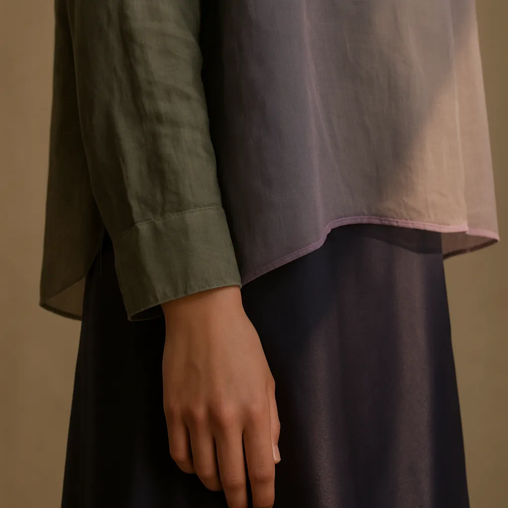
Material matters just as much. Matte surfaces ground colour, while satin and glossy finishes intensify it. Sheer fabrics and open knits make darker shades feel lighter, and layering creates subtle tonal shifts as the body moves.
How to Wear Dark Summer Colour
Building a warmer-weather wardrobe around deeper shades is less difficult than it sounds. A few practical approaches make the mood easy to adopt:
- Keep the silhouette light. A dark shade in a featherweight fabric, an open knit or a fluid slip feels like summer rather than winter. Volume and movement stop deep colour from reading as heavy.
- Choose one point of brightness. Let a single acidic or juicy accent do the work: a shoe, a bag, a scarf or a stripe of Fruit Punch against Aubergine Skin. Restraint makes the contrast land harder.
- Play with finish. Combine matte cotton with a satin skirt or a glossy belt so the same family of shades shifts as you move. Sheer overlays create depth without weight.
- Mix in skin. Bare shoulders, an open back or a halter neckline give duskier colours room to breathe and keep the overall look summery.
- Layer tone on tone. A Cloud Bloom top under a Solar Midnight jacket builds a quiet gradient that reveals itself gradually, especially in evening light.
- Let accessories set the mood. Darker stones, tarnished metal finishes and deep-toned leather feel more atmospheric than bright gold or silver.
These choices work as well for an alfresco dinner as they do for a long weekend or a wedding in the late afternoon. The same dark shades read differently in daylight and under lamplight, which is part of their appeal: an outfit that keeps changing as the hours pass.
The Evening Becomes the Season
For SS28, some of summer’s most compelling colour moments may happen after the sun goes down. The palette is an invitation to rethink what summer colour can be: not simply brighter, but deeper, more atmospheric and full of contrast.
Darkness, handled with care, does not cancel out the season. It gives it somewhere to go once the light fades.